To build a graph while cross-referencing data, observe it come to life using the PivotChart.
Sometimes the data available does not allow you to make a graph directly. You have to rework them a little before you can use them in graphics.
With the PivotChart, build your chart at the same time as a PivotTable.
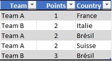
First, select your board. Then on the Insert menu, click PivotChart.
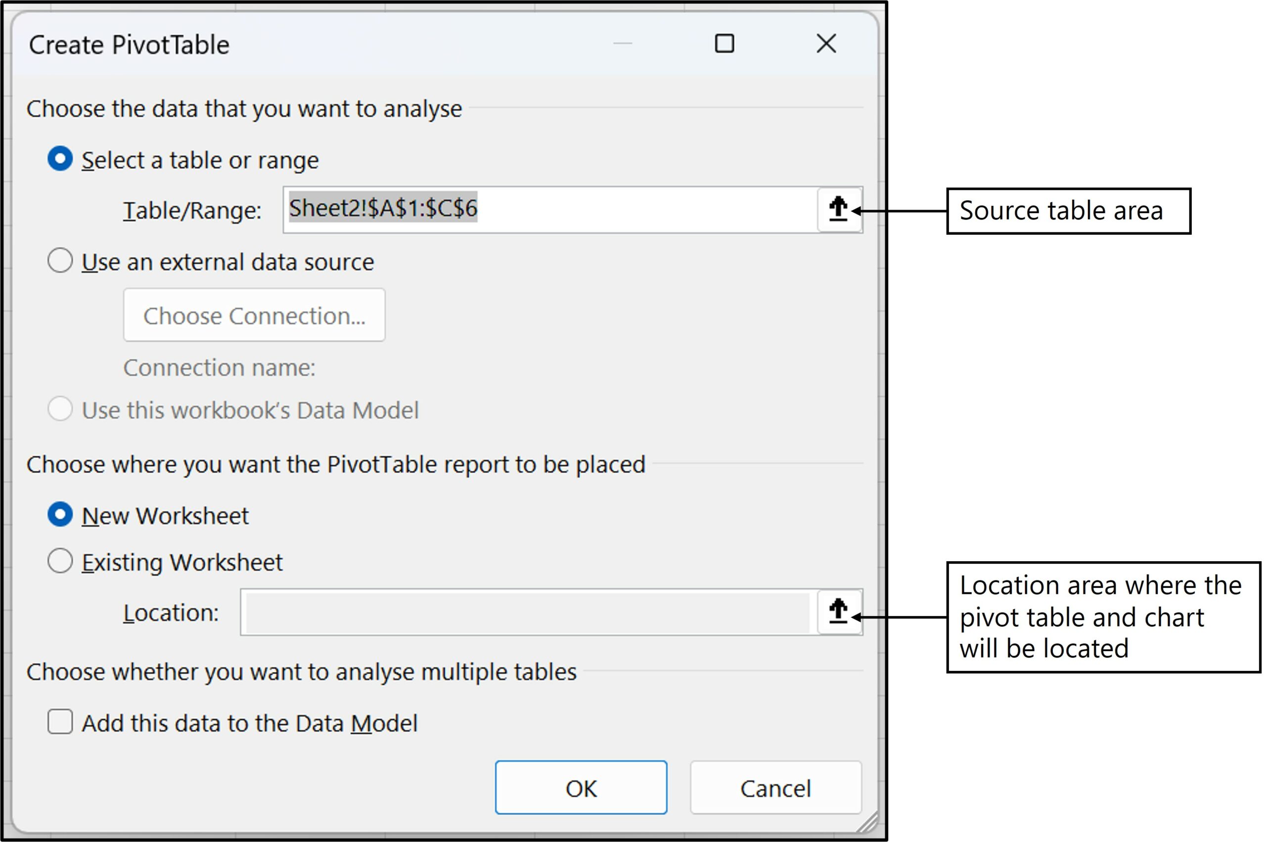
As with a pivot table, the configuration window opens. In the latter you must define the source and where the table and graph will be located.
Since you have selected your table, the source is directly populated.
Then you have the option to put the table and graph in a new sheet or on an existing sheet in a specific place.
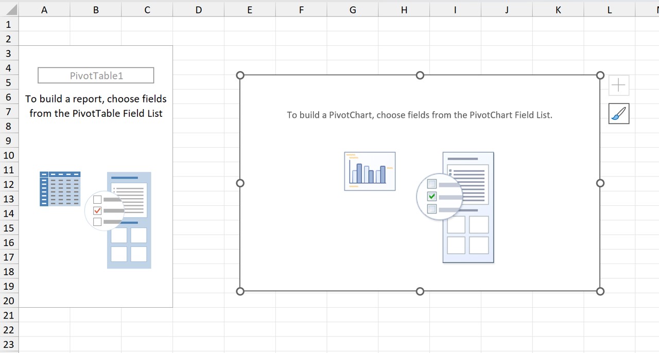
All you have to do now is build your table and graph.
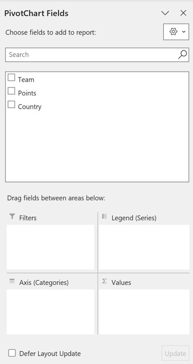
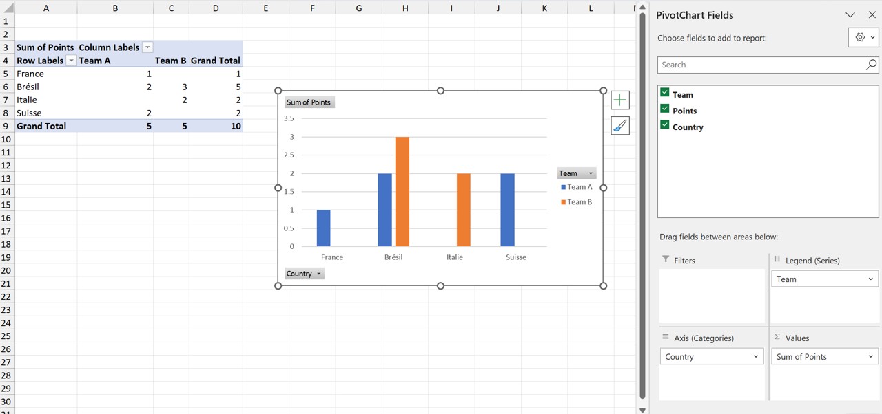
As you move the fields to the different areas, you‘ll see the table and graph build up as you go.
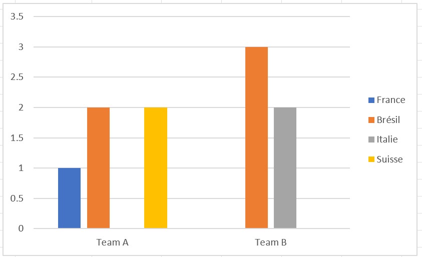
In the example below, we choose to display the points by country with a grouping by team.
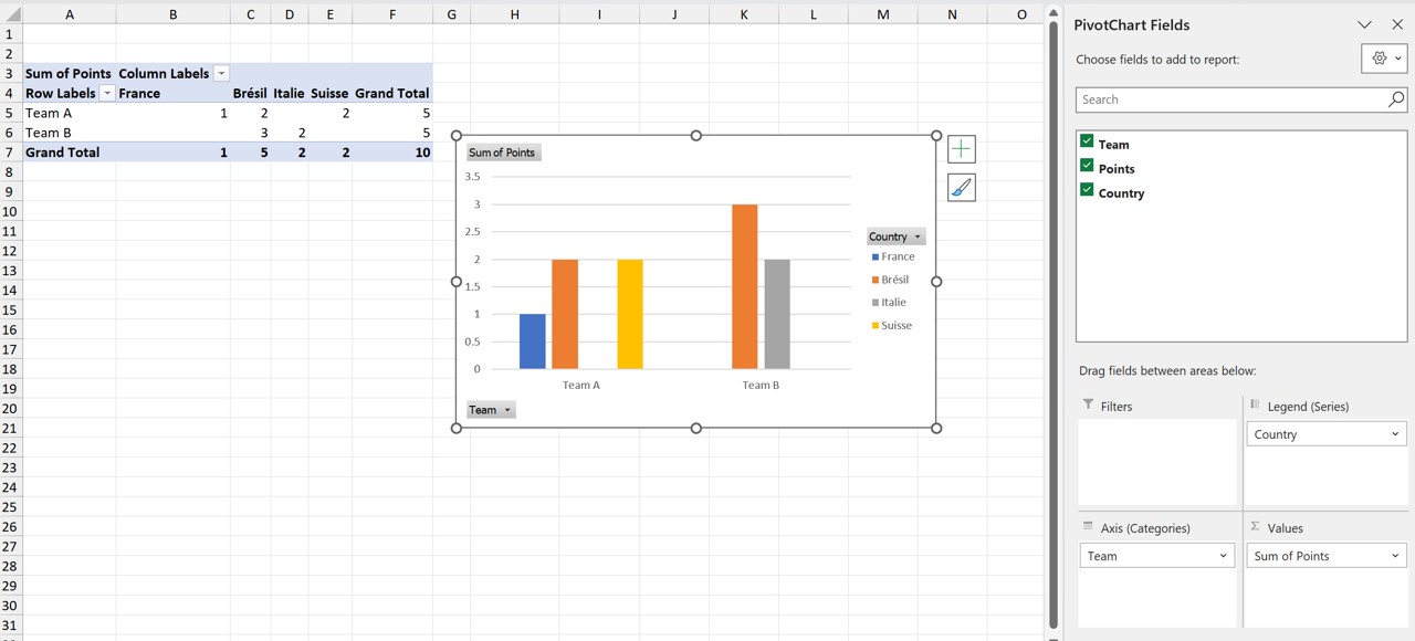
By changing the fields in the different areas, you can see your chart evolve. And thus refine the message you want to convey.
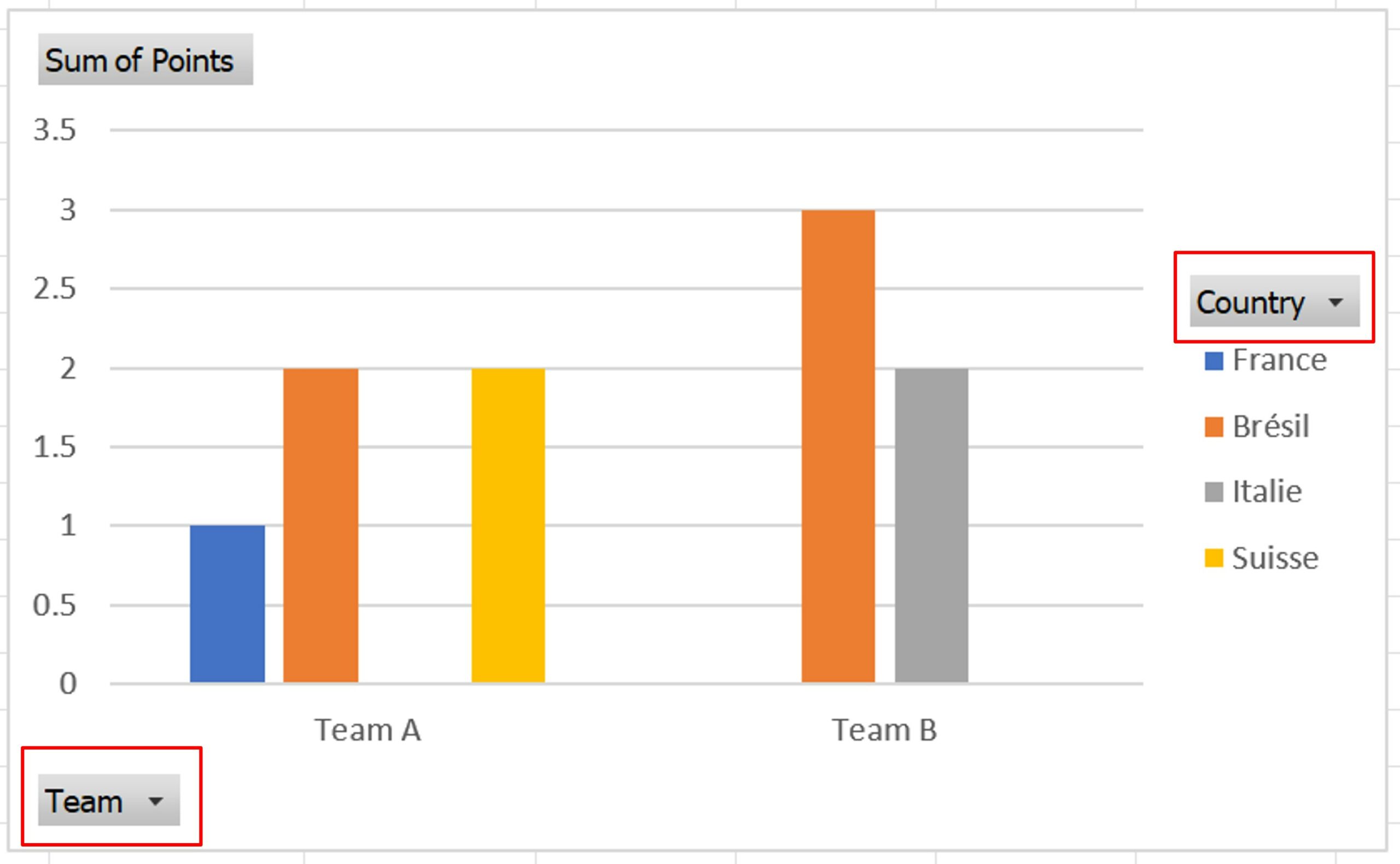
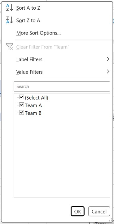
Directly from the graph, it is also possible to filter the data. To do this, click on the selectors. This opens the filter window for you. This allows you to choose what you want to display.
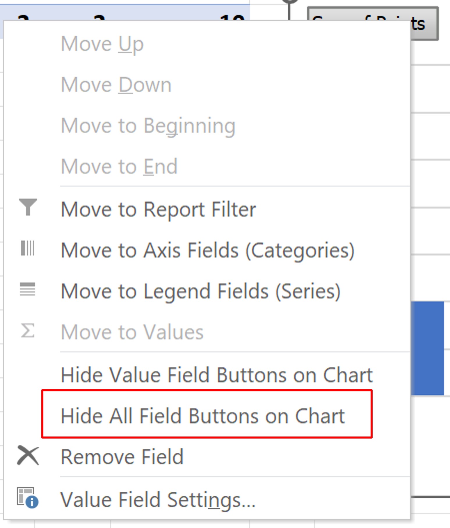
If you don‘t want to show the filter buttons, you can hide them. To do this, right–click on the graph. On the context menu, click Hide All Field Buttons on the Chart.
You get a “classic“ chart. Of course, you can change all the features:
- Display of captions, titles, etc.,
- Change the nature of the chart
- Adjust axes, and many other configurations
